ping@ping-design.com
+1.646.833.8301
Ping
Chen


Molly McGuires is an Irish and Celtic style, modern tavern. As the restaurant is a distinctly cultural atmosphere within a contemporary high-end restaurant, this logo is designed with multiple cultural elements, including an Irish green, Celtic patterns, a Shamrock leaf, and stylized typography that is historically Irish handwriting referenced. All of the elements are integrated through highly contemporary rendering.


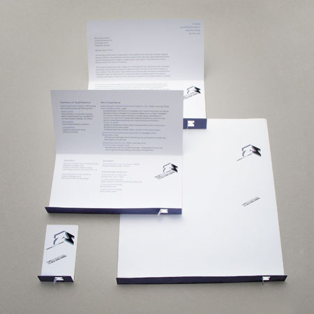
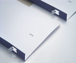
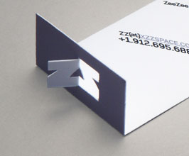
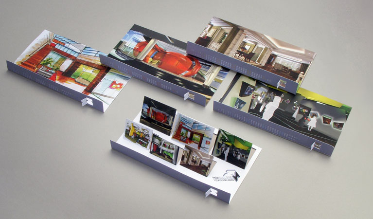
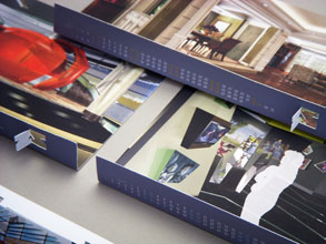
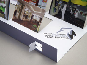
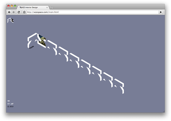
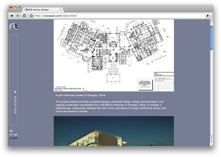
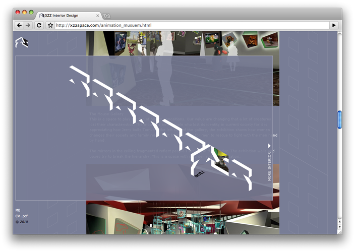
ZeeZee(ZZ) specializes in designing creative & sustainable interior spaces. As a promotional strategy, its identity is branded as a unified, concrete color and an opened “Z” door in a 3D style that stir viewers’ curiosity as if inviting them to explore the mystery of 3D interior spaces: her unique personal interpretations on diverse styles of interior architecture. This whole promotional kit includes a card, a stationary system, a calendar showing work samples, a teaser, a digital work sample piece, and a blog-style (imitation of interior tours in “skyscrapers” by scrolling the “elevators”) portfolio site.


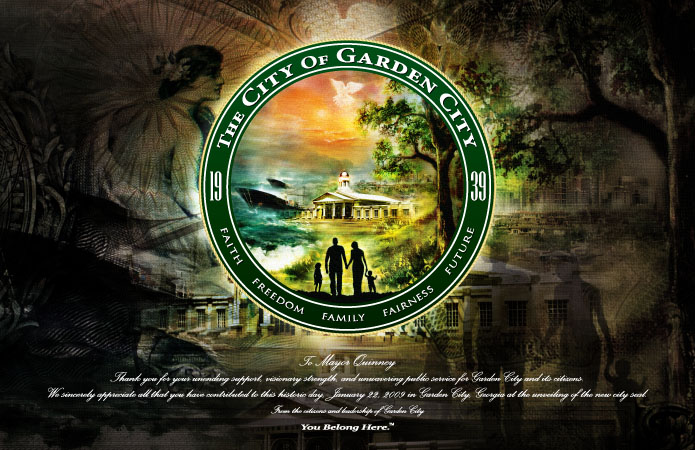
This is a re-brand project for Garden City, Georgia government. With the expansion of adding new land and their new city hall in a new, modern city center, Garden City has been growing to become an even more beautiful and ideal place to live. The new city logo illustrates a stylized Georgia State Flower, the Cherokee rose, with an organically elegant typography intergrading with “G” & “C” and leaves. The new city crest demonstrates the overview of new Garden City and the warm mood of family lifestyle happiness. This 360 degree re-brand project involves every brand-related aspect.


Tubby’s is a fun place for people who like seafood and music to hang out and relax. Like their tons of fresh seafood, the logo creates a relaxing mood and sense of humor by fishing in a tub on an ocean in nice weather. With the combination of typography, pictorial graphics, and sailing elements, its identity conveys the message of fresh and fun.


AdviceList.com is an informational site that lists hot topics with solutions of people’s daily issues and helps people with plentiful, useful “how to’s”. As the site’s name, the concept of the logo design concentrates on “advice” and “list” by many comment bubbles, implying response with abundant helpful information.


The South magazine is the resource for getting the most out of life on the Creative Coast and a celebration of the style of the new South. To meet their statement and keep the already recognized identity, the logo refinement concentrates on sexier letterforms, including fashionable contrasts, even letter weights & negative space, and fluid strokes.


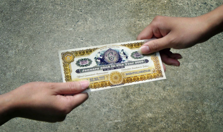
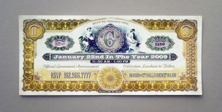
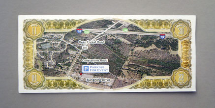
The City of Garden City, Georgia government, were going to run a re-brand project for the city. With the expansion of adding new land and their new city hall in a new, modern city center, Garden City has been growing to become an even more beautiful and ideal place to live. As a prologue to this re-brand project, this introductive and promotional campaign tries to create a mysterious mood to attract audiences to explore the “cultural treasure” of the new, advanced realm with their deeply historical roots. The series, an invitation, envelope, and ticket, with its bill-like form, express the value of the “everyone-wants” & “everyone-talks” topic. Award-winning piece.


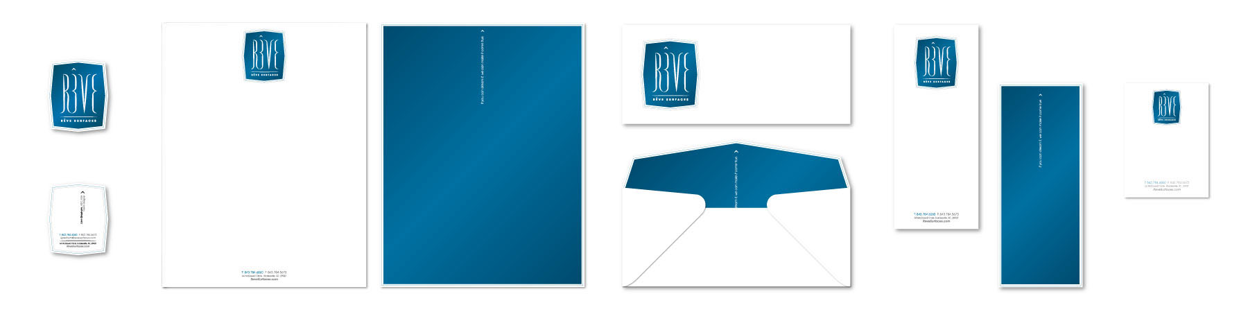
Rêve
Surfaces is a contemporary high-end material design showroom
for interior construction. Its collection includes most of first-rate
European material brands, such as Sicis, Waterworks,
Terra Viva, Vetrostone etc.
Meaning “sweet dream” in French, the Rêve logo is
visualized as soft and illusional
typography and formed to be elegant and pure,
with which its whole identity system attempts to be a stylized, modern,
high-end, and dream-making
world via its minimalism.
Award-winning piece.


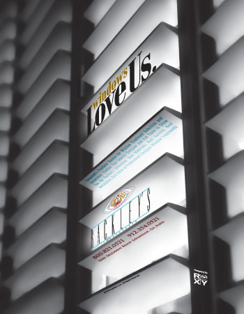
With a black & white close-up photo of a window blind, this advertisement shows the details and quality of Rackley’s Window Treatment. The 3D typography integrated into the giant building-like shot embodies the relation and attitude between Rackley’s and windows.


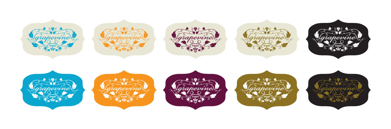
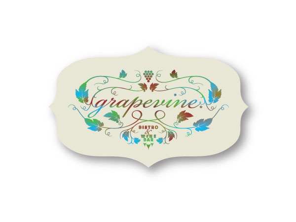
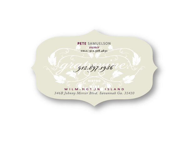
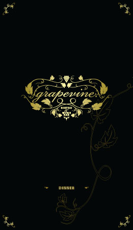
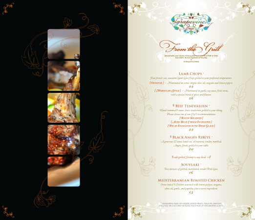
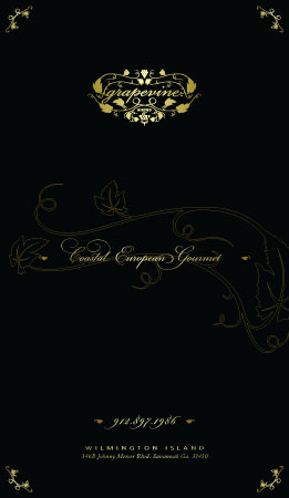
As this
Bistro & Wine Bar’s name, the Grapevine
logo obviously IS
stylized grapevines… (the image talks itself).
Award-winning piece.
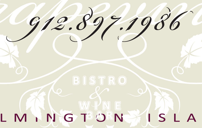


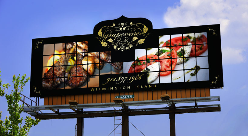
There
are only 3 seconds
in which to catch drivers’ sight with outdoor billboards. Within these
3 seconds, this design attempts to communicate 3 things: the delicious food, the Grapevine
brand, and the contact, one message per
second. Above these 3 things, with the tempting gourmet cuisine giving
out its scent via the “grape trellis”
grid, the overall visual language emotionally establishes an experience
of a high-end European restaurant.
Award-winning piece.


United Future is a design company endeavoring to discover future styles. The initials “U” and “F” fused with each other creates a canyon that paves the way for the future.


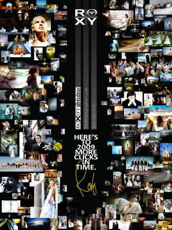
In the beginning of 2009, as a celebration of New Year and a one-page “yearbook”, this fashion magazine advertisement for Shot by Roxy, a first-rate photography studio, manifests the quality, the productivity, and more(double en-tundra) moments being seized in time.


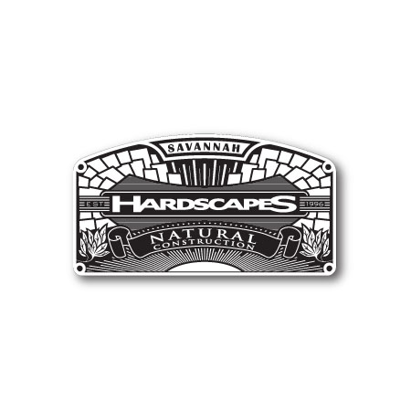
Savannah Hardscapes is a natural construction company specializing in various materials, surfaces, landscapes, and natural views. This crest design both incorporates those features and states the company’s established attitude and culture.


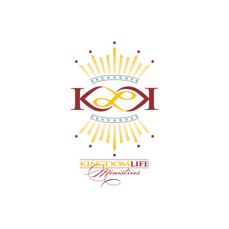
The key
concepts of KingdomLife Ministries logo are “reverse” and “eternal”, emphasizing with
its “anagram” the
reversal of people’s messy lives and their transition to eternal of
lives. In order to convey the message, the visual language includes the
design elements of crowns (also the lights), column-like “K” &
“L”, and also the infinity-like
symbol.
Award-winning piece.


|
Hopscotch -- on the wall? How do people play? How can people even stand; let alone jump? This Nike commercial is metaphorized for the spirit of the corporation with the original slogan -- Just do it, which tries to make people feel that they would become more powerful by wearing Nike.  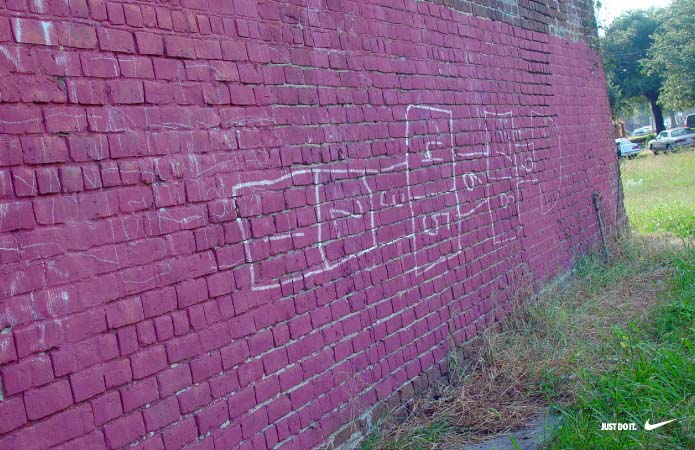 |
|

|
|
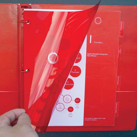
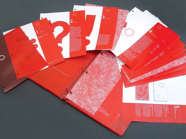
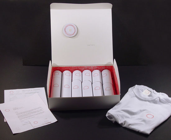
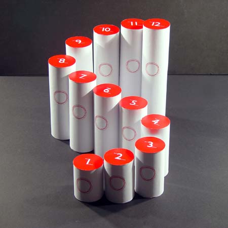
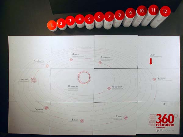
This whole is designed for an international educational organization, including the logo, the stationery, a manual, and direct packaging. Apollo is the god of the sun. The red scribble presents the sun, which is the symbol of power and brightness, enlightening people, warming people, and providing a bright future. At the same time, the scribble creates the feeling of an uneducated childlike doodle, but gradually, the main shape becomes a more and more perfect circle, which aims to be well educated. Award-winning piece.  |
 |
 |
 |
 |
 |
 |
|||||||
 |
|||||||||||||
|
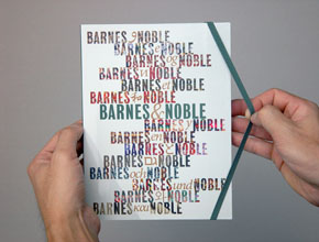
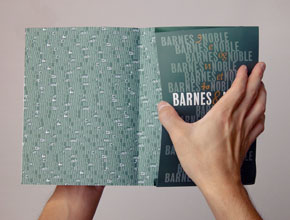
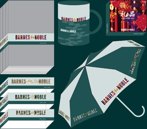
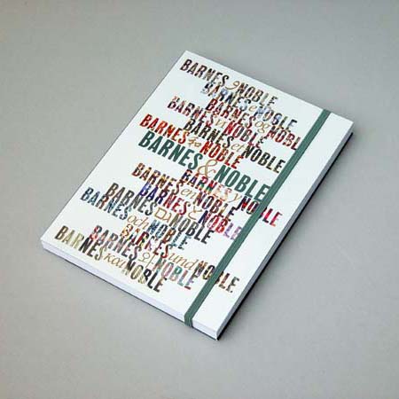
By
composing various cultural
patterns with the words "Barnes" and "Noble", and
different ampersands from different
languages, surrounding the traditional Barnes
& Noble logo, this design expresses the impression
of cultural diversity and rich
knowledge.  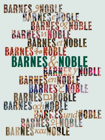 |
 |
 |
|
||||||
 |
|||||||||
|
This series deliberately literally
displays the characteristics of black white things in our lives to
suggest the relationship
between black and white people.  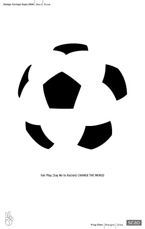 |
 |
 |
 |
||||

|
|||||||
|
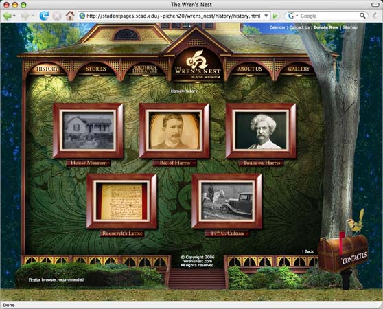
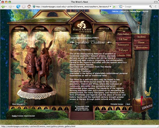
This web site was designed for the Wren's Nest, a
literary museum and also the home of the famous 19th century author, Joel
Chandler Harris, who created the well-known characters, such
as Uncle Remus, Brer Rabbit,
etc.  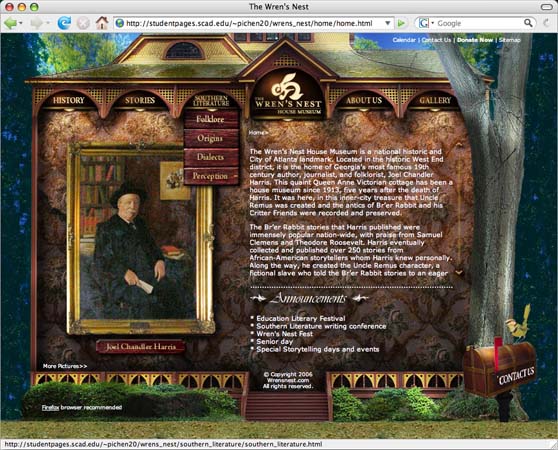 |
 |
 |
 |
||||

|
|
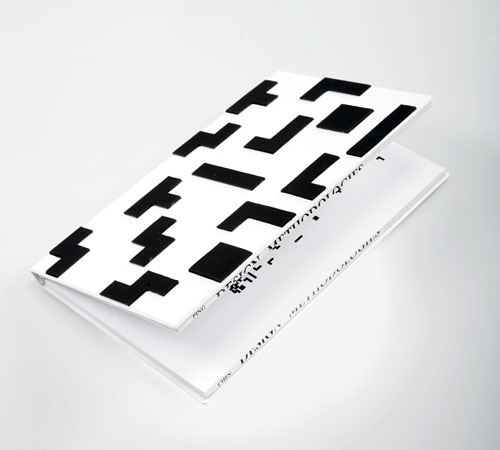
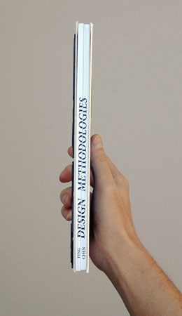
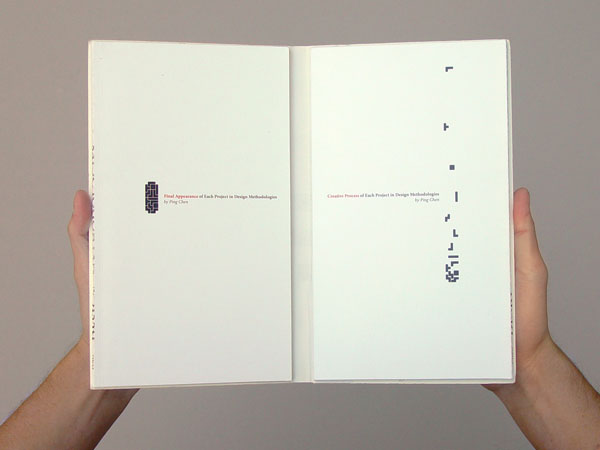
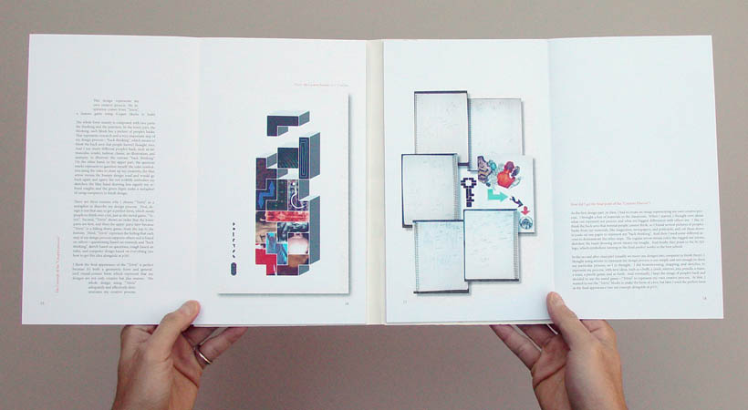
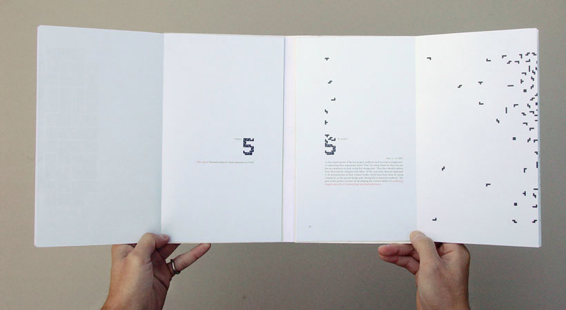
This book is about my personal
design process, which illustrates my five projects. There
are two sub-books
inside this entire book. The one on the left displays the final appearances of my five
projects, and the one on the right shows my creative
processes of those five. The two sub-books can be read
either individually
or simultaneously.
Continuations between these two symmetrical sub-books make readers
perceive how my thoughts develop.   |
 |
 |
 |
 |
 |
||||||
 |
|||||||||||
|
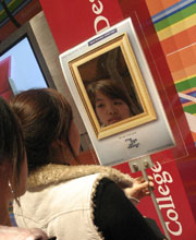
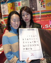
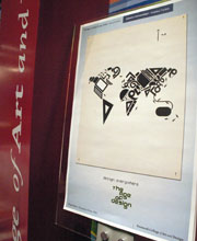
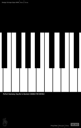
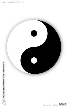
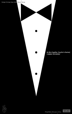
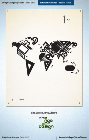
Design College Expo 2005, Seoul, Korea -- the theme, The Age of Design was personally interpreted as "design: everyone", "design: everything", "design: everyday", and "design: everywhere" focused on "who, what, when, and where", to respond to our daily lives overflowing with design nowadays.   |
 |
 |
 |
|
|
||||||||||

|
|||||||||||||||
|
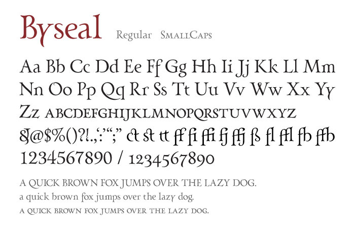
This typeface, Byseal, was designed with an attitude after the postmodern perspective by incorporating postmodernist and modernist design values with classical typefaces' successful design forms. Based on the research through 600-year typeface design history and 5 typeface classifications, this pure text typeface attempts to own timeless, elegant forms with great readability in huge display size as well as in tiny body-text size.  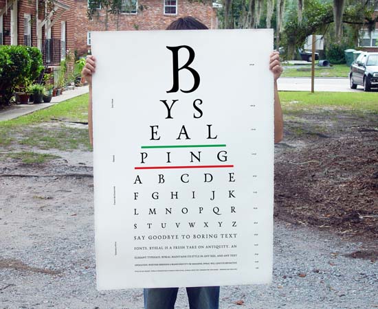 |
 |
||

|
|
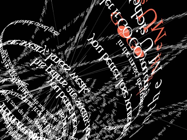
This poster was designed for the song -- Lose Yourself
-- of EMINEM, a Rap singer. The expressive type treatment overflowing
with passion creates
a messy 3D space, in which people feel
lost. This visual language, also with certain re-presented
lyric responding the singer's featured tone, symbolizes the EMINEM Code.  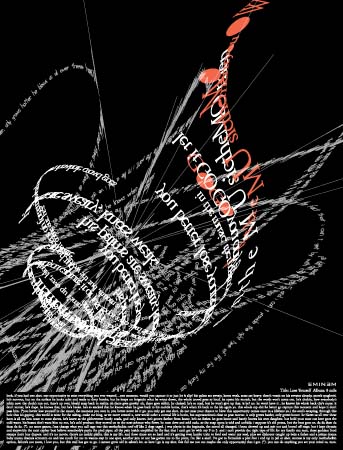 |
 |
||

|
|
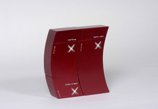
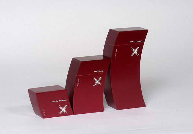
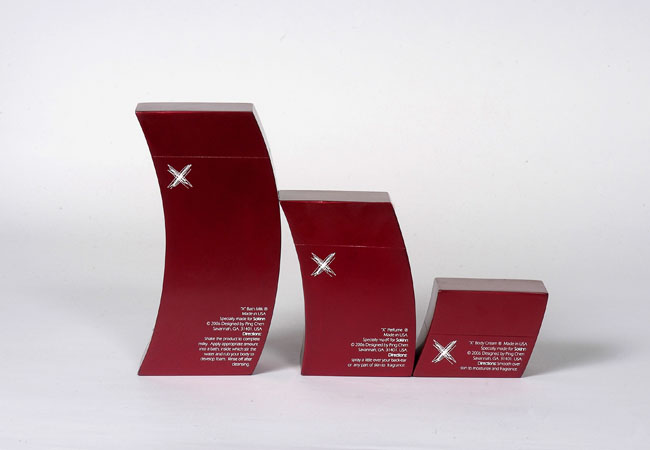
This personal care set, focused as 3-D
branding, including Perfume,
Body Cream, and
Bath Milk, is
marketed for young ladies, inspired by a female
of great mystery. This set seems familiar with the square-like
bottles, but feels unusual.
The cross logo, the dynamic imagery, the curved forms, the diverse
displays and overall visual language show the emotion of un-guessable possibilities.  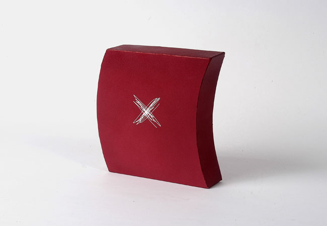 |
 |
 |
 |
||||

|
|
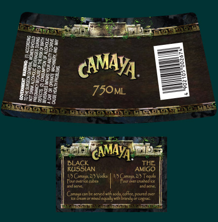
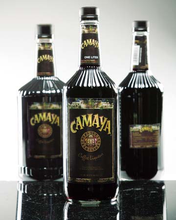
Camaya
is a famous brand with a long history in coffee liqueur market. As the
winning design of the real project, it satisfies the client’s
expectations with a fresh design, long shelf life, working well on the
lower shelf, and effectively showing Camaya’s
characteristics by emphasizing the Mayan
calendar, sculpture,
and architecture to
convey a mood of Mayan
civilization, where is Camaya Coffee
Liqueur initially came from.  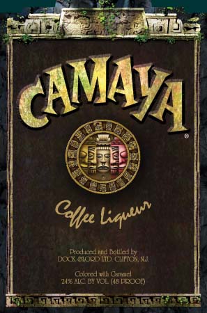 |
 |
 |
|||

|
|
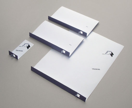
These are some recent samples of my logo design, for:  |
|||||||

|
|
||||
| Experience
//////////////////////////////////////// 2013 – Present // Design Director // Mega Info Tech Co., Ltd. Shanghai, P.R.C. 2011 – 2013 // Senior Art Director // RocketDog NYC. New York, NY. USA. Direcing and leading a design team to create multi-layered design solutions, such as identities, ads, websites, and books, for iHome, MobiMunch, NowWhat Research, Stonehenge, TwoBoots, Classic Car Club, etc 2009 – 2011 // Art Director //& 2008 – 2009 // Senior Designer // & 2007 – 2008 // Design Intern // Titan Advertising Group. Tybee Island, GA. USA. Branding for City of Garden City, Durham, Southern Motors, Grapevine, Rêve, Tubby’s, etc., including cross-platform strategies, online & digital solutions, user interactive experiences, advertisements, brochures, packages and brand identity systems. Management of a design team. 2007 // Teaching Assistant // Savannah College of Art and Design. Savannah, GA. USA. Developed teaching strategy & evaluation criteria, presented lectures & critiques, provided guidance, and aided in grading for senior level class. |
2006 // Freelance // Barnes & Noble, Inc. Savannah, GA. USA. Developed a cross-cultural, promotional campaign for Barns & Noble to be implemented nationally. 2005 // Freelance // The Black Prince Distillery, Inc. Clifton, New Jersey, USA. Design selected amongst around 50 entries for Camaya brand coffee liqueur. Released for real marketing. 2000 – 2004 // Art Director // ADK − Shanghai Fortune Advertising Co., Ltd. Shanghai, China. Duties involved concept building, including advertisements, web sites, brochures, posters, logos, TVC, packages, and CI designs, with directing over 10 designers. 1999 – 2000 // Editor // OTV − Shanghai Oriental TV Station Ad. Biz Co., Ltd. Shanghai, China. Focused mainly on print publication for potential advertisers, including audience rating analysis report. |
Education
///////////////////////////////////////// 2005 – 2008 // Savannah College of Art and Design [SCAD], Savannah, GA. USA, M.F.A., Graphic Design, Highest Honors, GPA 3.84 2007 // [SCAD], Savannah, GA. USA, Certificate in Typeface design 1995 – 1999 // Fine Art College of Shanghai University, Shanghai, China, B.F.A., Advertising Design Expertise ////////////////////////////////////////// Mastery of: Photoshop, Illustrator, InDesign, Dreamweaver [HTML, CSS], FontLab, Acrobat, MS Office, knowledge of Flash & JavaScript/jQuery. Large-scale, concept-oriented branding and advertising strategies inducing detailed, visually-oriented design languages. International design style communicating beyond cultural boundaries. Human-centered design solutions with sustainability exclusively established for each project. Fluent language skills in English & Mandarin. |
Exhibitions
// Publications //////////////////// 2008 // “LicensArt” Logo Design Case Study, presented at The Association of Free Community Papers Annual Conference [AFCP], Palm Springs, California, 2008 2008 // Showcased work in the [SCAD] Catalogue 2007 // Designs exhibited at 2007 Savannah Secessssion, outstanding student design show, [SCAD] 2006 & 2007 // Selected & participated in poster projects exhibited at International Young Designers’ Exhibition [YODEX], organized by Taiwan Design Center [TDC], Taiwan World Trade Center, Taipei, Taiwan // The Posters of 2007 also exhibited at Vernissage Exhibition, SCAD-LaCoste, LaCoste, France, 2007 2005, 2006, & 2007 // Selected & participated in poster projects exhibited at International Design College Expo [DCE], organized by Korea Institute of Design Promotion [KIDP], Seoul, Korea // The posters of 2005 also presented at Sabanci University, Istanbul, Turkey, 2005 |
Activities
// Achievements
//////////////// 2007 // Selected & served on the “Smart Design” Poster Project Design Committee, [YODEX] // Also designed the “Smart Design” logo & Layout format for the project. 2007 // Member of American Institute of Graphic Arts [AIGA]. 2007 // Member of Art Directors Club [ADC]. 2007 // Committee member in “2007 Savannah Secession” design team, selected as the best seven students, [SCAD]. 2007 // Selected & served on the “Interactive Print: Engage [IP]” Poster Project Design Committee, [DCE]. // Also designed the [IP] logo for the project. 2006 // Selected & served on the “Change the World” Poster Project Design Comittee, [YODEX]. |
Awards
////////////////////////////////////////////// 2010 // Gold Award, Stationery Package (Garden City), Addy Awards, American Advertising Federation [AAF], USA. 2010 // Bronze Award, Stationery Package (Durham), Addy Awards, [AAF], USA. 2010 // Bronze Award, Stationery Package (Excelsia), Addy Awards, [AAF], USA. 2010 // Bronze Award, Logo Design (Garden City), Addy Awards, [AAF], USA. 2009 // Gold Award, Logo Design (Rêve Surfaces), Addy Awards, [AAF], USA. 2009 // Silver Award, Logo Design (Grapevine Restaurant), Addy Awards, [AAF], USA. 2009 // Silver Award, Logo Design (KingdomLife Ministries), Addy Awards, [AAF], USA. 2009 // Silver Award, Advertisement (Zielenbach Photography), Addy Awards, [AAF], USA. 2009 // Silver Award, Menu Design (Grapevine Restaurant), Addy Awards, [AAF], USA. 2009 // Silver Award, Identity System Design (Rêve Surfaces), Addy Awards, [AAF], USA. |
2009 // Bronze Award, Outdoor (Grapevine Restaurant), Addy Awards, [AAF], USA. 2009 // Bronze Award, Invitation Series Design (City of Garden City), Addy Awards, [AAF], USA. 2008 // Nomination, Brochure Design (I.D.), Adobe Design Achievement Awards [ADAA], Adobe Systems Incorporated, USA. 2008 // Nomination, Poster Design (E-code), [ADAA], Adobe Systems Incorporated, USA. 2007 // Nomination, Brochure Design (A Logo’s Birth), Scaddy Awards, [SCAD], USA. 2007 // The National Dean’s List, USA. 2006 // Honorable Mention, Book Design (Design Methodologies), 2007 Savannah Secession, USA. 2006 // Silver Award, Package Design (X Fragrancy), Scaddy Awards, USA. 2006 // Silver Award, Newspaper Ad Campaign (Say No to Racism), Scaddy Awards, USA. 2006 // Silver Award, Web Site (Wren’s Nest), Scaddy Awards, USA. |
2006 // Nomination, Brand Identity (Apollo Education), Scaddy Awards, USA. 2006 // Nomination, Direct Marketing (Apollo Education), Scaddy Awards, USA. 2006 – 2008 // Highest Honors Scholarship, [SCAD], USA. 2004 – 2006 // Combined Honors Fellowship, [SCAD], USA. 2002 // Merit award, Chinese Advertising Annual 2002, Shanghai, China. |
|||||||
  |
 |